
31 Agosto 2009
English
Colors
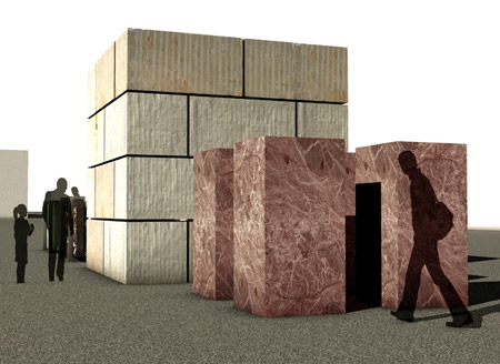
Project for VISTO Architectural Workshop’s Colors pavilion
[photogallery]colors_album[/photogallery]
The emphasis on the communicative action of architectural surfaces that characterizes contemporaneity involves the world of stone textures as well, in its most complex aspects of graphic and compositional nature, and also in its most fundamental and inherent characteristics of colours and material grains regarding the stone itself. Even more than in the past the mineral texture of stone materials and the visual and tactile sensations that come from it aim to represent the image, opulent in some cases, minimal in others, of a series of cultural and economical values leading to ideas as beauty, luxury and wellness.
For ages multi-chromatic breaches designed by stains and veins, stones of varied nature with compact and homogeneous or veined and arabesque-like tones, onyxes and alabasters rich in shadows, pointed granites, white, black or bright golden marbles, or full of green, livid or scarlet mineral pigments, have been appreciated as coloured materials in itself, able to express in bidimensionality a potent and independent chromatic deepness that can be activated thanks to the simple polishing without using varnishes, enamels or other treatments that enrich the chromatic qualities.
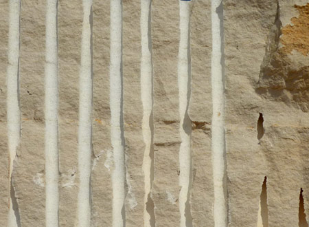
Details of a block in Pietra Senape for the manufacturing of Piba Marmi’s Colors space
Today more than ever the project of architectural surfaces employs the generosity of the iridescent lithological universe, and above all of previously unseen European or exotic stones, to be discovered or re-discovered and searched to create a continuously “brand new effect”, limiting to a simple work of re-composition and variation of the textural pattern dictated by the crystalline structure of the stone, with certain results of brilliant and photogenic eccentricity. Or yet, the contemporary architectural culture frequently chooses more simple chromatic proposals, pastel and soft tones exalted by velvet-like surface finishing. Third-millennium stones and marbles come from Italy but also from emergent extractive areas and find varied commercial denominations in the complex and articulated proliferation of a type of onomastics that reveals numerous lithic and chromatic identities.
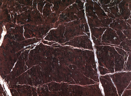
Purple surface of Rosso Levanto, protagonist of Colors exhibit space
To reaffirm a clear and recognizable identity in this highly competitive and rapidly changing sector, Colors is conceived as a further project of exhibit design by PIBA Marmi, signed by VISTO Architectural Workshop for the next editions of Abitare il Tempo and Marmomacc in Verona. In the exterior space the visitor will find the stones commercialized by the brand from Chiampo, moving among plates of Iberian and North African limestone with soft ebony, grey or yellow nuances, and the ones of Rosso Levanto blocks, a prestigious Liguria’s marble with more net purple tints.
Pietra di Fatima, Grigio Ash, Pietra Senape, Nero Assoluto, Pietra di Brera are some of the names that PIBA Marmi has given for long time to his original stone collection, employed to shape architectural projects, outdoor settings and design pieces. This lithotypes will be used in Colors to realize a sort of poly-chromatic entrance for the fair events in Verona in next autumn, a sensorial access to be passed through touching the colours of stone.
by Davide Turrini
Go to: PIBA Marmi