
14 Ottobre 2007
English
The Beyeler Foundation Museum, Riehen (1991 – 1997)
by Renzo Piano*
After having designed the small, delightful museum for the De Menil Collection in Houston, Renzo Piano designed a private museum in Europe on behalf of the Beyeler Foundation: this museum is situated at Riehen, near Basle and the Swiss-German border. Positioned along a busy main road near to the 19th century Villa Berower’s gardens, Piano’s architectural creation constitutes a well-balanced solution to the requirements of Hildy and Ernst Beyeler, the gallery owners who in the space of forty years have collected a series of important artistic works, including items by Cèzanne, Giacometti, Klee, Lèger, Matisse, Picasso and Rothko, to name but a few.
This one-storey building, situated in the middle of a park, boasts sturdy parallel walls and a light, refined glass roof that softens the zenithal light, redistributing it among the museum’s various rooms, toning down its natural variations which are barely perceptible from within the museum.
On the outside, the long, solid walls are clad in stone. Inside, there are four parallel central walls, each 110 metres long and equidistant (set 7 metres apart), containing the gallery, a space composed of three long spans, transversely joined together every 11 metres. This space is fluent, homogeneous, continuous, with all its plant and systems cleverly hidden from view. The only things that are immediately visible are the elements constituting the architectural composition itself: the smooth, plastered walls, the wooden floor and the luminous ceiling.
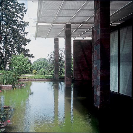
The spatial effect is one of a harmonious blend of exhibitory logic (as seen in the sequence of the diverse rooms) characteristic of 19th century museums, and the contemporary fluidity of the elongated spans providing a “telescopic” perspective of the outside. An attempt has clearly been made to provide a degree of continuity between architecture and nature: the walls, together with the extremely lightweight roof, form a continuum with the surrounding park; the floor blends visually with the pond in the garden, situated at the same level as the floor itself, and the inside and outside of the aisles are only prevented from constituting a physical continuum by the presence of large glass windows.
Great care has been taken to provide the visitor with an educational itinerary facilitated by certain architectural details; these include the western façade’s “winter garden”, looking out over the landscape, which provides the visitor with space and time for reflection. The light coming in and the very perception of this room differ from what is seen in other parts of the museum, albeit contained once again by parallel walls of a regular height. This long, narrow section (smaller than the gallery itself) forces the visitor to look out on the natural surroundings. From the outside, the large glassed surface area neutralises the height of the wall making up the western façade; the same effect is achieved by the parallel wall forming the external border of the area, in that being similar to, but lower than, the façade, tends to minimise the environmental impact of the new construction.
On the entrance side, the walls are lighter and are transformed into an original, elegant colonnaded façade that rises up from the pond and tends to dilute the harshness of the walls themselves. A similar compositional format has also been adopted on the opposite side of the building, albeit with certain variations. The two rhythmic, chiaroscuro-effect colonnaded façades thus offer an interesting interface between the new museum and the stratified natural environment constituted by the old park.
The east-facing wall is a more complex structure, arranged at various different heights and in diverse directions, with gaps which one can walk through, and as such constitutes the façade that faces onto the Baselstrasse road. Renzo Piano calls this wall a “formative zone” in that it generates the entire architecture of the museum as such: indeed, on closer observation one can begin to understand the strong link between the building and its chosen site. The architect utilises the continuity and the imperious architectonic character of the walls to merge the surrounding landscape into the building’s structure; he manages to amalgamate stone walls, fences, façades, the gallery, the garden and the surrounding landscape into a well-balanced whole.
The walls of the Riehen museum rise up out from, and shape, the surrounding ground, and are topped by a light, high-tech rectangular roof consisting of a double layer of glass with an interstitial air-space accessible for maintenance purposes. The modern composition, clearly influenced by the Neo-plasticism so dear to Mies Van de Rohe, is constituted by flat elements both separating and joining spaces in a free manner; the role assigned to the stone is that of guaranteeing a firm relationship with the ground, and of creating the linking elements that make this building part of the surrounding natural landscape and of the historical town of Riehen.
The stone employed here is very similar to the red sandstone used to build Basle cathedral – a stone that is commonly found in this part of Switzerland, but one that is often discarded due to the fact that it is not particularly hard-wearing, but rather delicate and crumbly. After much research, a porphyry from Argentina with excellent technical characteristics was chosen, and dressed to show a rough surface that appears already worn by the ravages of time.
The cladding of the load-bearing walls consists of rectangular, single-sized slabs (50 x 25 cm. and of a constant thickness) mounted in parallel, aligned rows: the surfaces of these slabs have been treated to make them vibrate in the light. The mortar joints are barely visible, given that they are of a similar hue to the stone itself.
The stone cladding has been mounted in parallel rows with the base twice the size of the vertical side, thus emphasising its horizontal character.
The mounting arrangement is worthy of note, in that the network of joints entirely covers the building’s walls, like a thin, light graphic pattern projected onto the stone. This is extremely evident in the corners, as the joint is always situated right in the corner, thus preventing the observer from seeing the true thickness of the cladding. An accurate cut of the stone slabs enables them to be placed side by side without the need to superimpose them at all. The graphic abstraction of the modular network frames the roughness of the surfaces of the slabs and the vibrant colours of the stone itself.
Gabriele Lelli
* The re-edited essay has been taken out from the volume by Alfonso Acocella, Stone architecture. Ancient and modern constructive skills, Milano, Skira-Lucense, 2006, pp. 624.